Sublime Text has a handy feature called “Minimap” which shows a small condensed version of your text file along the right hand margin. This gives you a high level view of the file you’re working in and what the file looks like if zoomed out so far that you could see all the text on one screen. This can help in navigating around very large files. I took some inspiration from this feature, thinking that if it can be useful for text files, it may also be useful for datasets! I’m writing an R package for exploratory data analysis in the browser with React and the Minimap is the first feature that I’d like to showcase to demonstrate what’s possible by leveraging a front-end web application to power data analysis. Please read A Front-end for EDA for a more detailed introduction to this project.
A common problem when working with data is trying to understand the big picture from the very small sliver that you can view on your screen at any given time. Imagine your dataset as a text file that we can zoom out to a high level just like Sublime’s Minimap. By placing each variable’s distribution side by side, you can understand a lot about the data that otherwise you may not be able to see without plotting or summarizing each variable separately.
Let’s see what we can learn with this kind of visualization. Please
note that this is a very early prototype and there are a lot of
improvements and tweaks necessary before these minimaps will be good
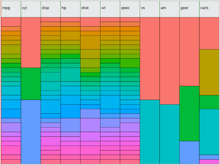
enough to release. First, let’s look at a dataset that should be very
familiar to R programmers, mtcars:

I am using the same method for selecting colors as used in ggolot2 to
visually distinguish each value of each variable independently. This
allows you to quickly see the distribution of each variable. One feature
not shown here is a tooltip that will render when hovering over the
minimap containing the variable name, value, count, and percent of total
observations. For example, hovering over the first value of
cyl would tell you that the value is 4 and the count is 11
observations, representing 34% of the total.
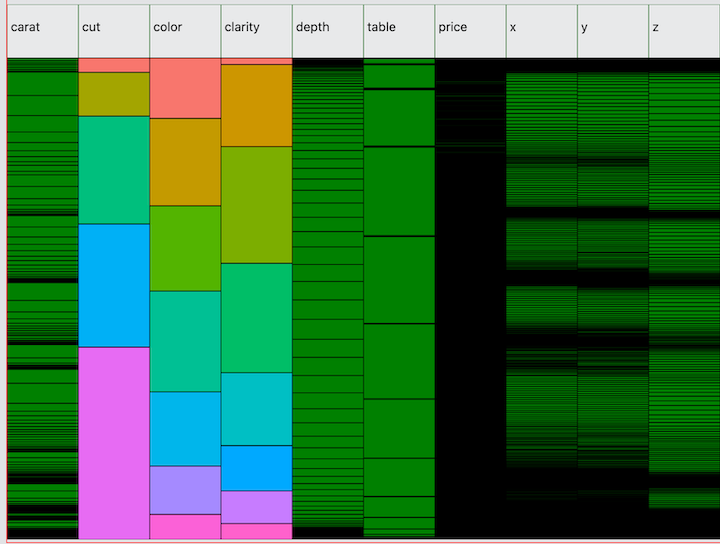
Next, here is the diamonds dataset from ggplot2. Unlike mtcars, this
dataset has several high cardinality variables—caret,
price, x, y, and z.
Note the normal distribution of depth. Compare this to
ggplot(diamonds, aes(x=depth)) + geom_density().
In the minimap, you basically get a “top-down” view of the density
function.

Also notice that there are several interesting values of
price where you can see green cells peeking through the
black borders. From this we can see that there are a few values at which
multiple observations are concentrated in what is a high cardinality
variable without many repeated values. To discover this in R, you could
run ggplot(diamonds, aes(x=price)) + stat_ecdf()
and look for the tiny bumps in the cumulative distribution function
where the y-values flatline. But typically it is not easy to detect
anomalies in high cardinality variables. The Minimap visualization is
still very crude for such variables. Still, it is surprisingly easy to
find strange values and in testing I was able to locate a strange clump
of values in a dataset that I later tracked down to a formula error in
the source csv file!
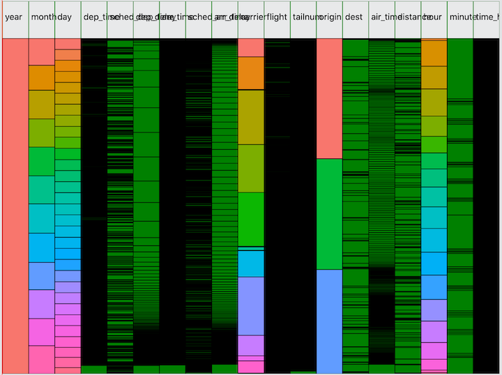
Let’s look at one more dataset: flights from the nycflights13 dataset. The column headers still need a lot of work!

Now I ask you, how long would it take to give you this level of
visibility from a) printing the dataframe, b) running
summarize or count on each variable, and c)
finding a decent plot that works for each variable? I’m not going to
argue that the Minimap is a magic bullet—just like Sublime’s Minimap
won’t magically give you all the insight you need to refactor your code.
But it’s a useful tool in the toolkit combining in one visualization
what would otherwise require running through several different pieces of
output.
How these work
The minimaps are made from SVG rect
elements rendered by a React application served by the Fiery
package in R. When the React application is launched in the browser,
Fiery will listen for web requests from the front-end which enables R to
run some functions and return data to the browser as json. One of these
functions I’ve written will tabulate all the variables in a dataframe,
returning the values and counts of each variable as an array called
vartabs as in the following example for mtcars:
{
    "vartabs": [
    {
        "name": "cyl",
        "value": [
        {
            "cyl": 4,
            "n": 11
        },
        {
            "cyl": 6,
            "n": 7
        },
        {
            "cyl": 8,
            "n": 14
        }]
    }],
}
My Minimap is a React component that I call with the following props:
<Minimap vartabs={props.vartabs} varcolors={props.colors} n={props.n} />The varcolors prop is an array of the same dimensions as
vartabs, containing the color chosen from a color palette.
The Minimap component loops over the vartabs array to
generate the rect elements for each variable name as column
headers and then calls a VariableRect component to handle
each variable individually. Leaving aside the code for managing the
tooltip that runs on mouse hover events, the Minimap component looks
like this:
function Minimap(props) {

  const { vartabs, varcolors, n } = props;

  if (!vartabs || !n) {
    return "Loading Minimap...";
  }

  // TODO: dynamically size the map based on number of variables!
  const mapWidth = 800;
  const mapHeight = 600;

  // create rect elements for column headers
  const colHeaders = vartabs.map((v, i) => {
    return (
      <Fragment key={v.name}>
        <rect
          key={v.name}
          x={i*mapWidth / vartabs.length}
          y="0"
          width={mapWidth / vartabs.length}
          height="60"
          stroke="green"
          fill="white"
          fillOpacity="0.2"
        >
        </rect>
        <text x={4 + i*mapWidth / vartabs.length} y="30">{v.name}</text>
      </Fragment>
    );
  });

  // create rect elements for the values of each variable
  const cells = vartabs.map((v, i) => {
    const x = i*mapWidth / vartabs.length;
    const fillColors = varcolors[i].value;

    return (
      <VariableRect
        key={v.name}
        vartab={v}
        x={x}
        varWidth={mapWidth / vartabs.length}
        n={n}
        varHeight={mapHeight}
        fillColors={fillColors}
      />

    );
  });

  return (
    <div className="minimap">
      <h3>I am a minimap!</h3>
      <svg width={mapWidth} height={mapHeight}>
        <g>
        {colHeaders}
        {cells}
        </g>
      </svg>
    </div>
  );
}
The VariableRect component’s job is to loop through each
value of the variable, determining the appropriate height based on the
count of values.
function VariableRect(props) {

  let prevHeight = 60;  // fixed height for column headers
  let y = 0;

  return (
    <Fragment key={props.vartab.name}>
      {props.vartab.value.map((cell, rownum) => {
        y += prevHeight;
        const h = cell.n / props.n * (props.varHeight - 60);
        prevHeight = h;
        return (
          <CellRect
            key={`cell_${rownum}`}
            cell={cell}
            n={props.n}
            varname={props.vartab.name}
            rownum={rownum}
            x={props.x}
            y={y}
            width={props.varWidth}
            height={h}
            fillColors={props.fillColors}
          />
        );
      }
      )}
    </Fragment>
  );
}
The basic implementation of the CellRect component is
quite simple, since all the dimensions have already been calculated. The
reason for making it its own component is because I’m also using it with
event handlers to enable the tooltip (removed for brevity!).
function CellRect(props) {

  const fillColor = props.fillColors[props.rownum] || 'green';

  return (
    <rect
      key={`cell_${props.rownum}`}
      x={props.x}
      y={props.y}
      width={props.width}
      height={props.height}
      stroke="black"
      fill={fillColor}
      fillOpacity="1.0"
    >
    </rect>
  );
}
Reproduction in ggplot2
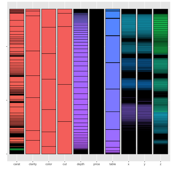
Is it possible to reproduce these minimaps in R? With ggplot, anything is possible! One approach is to map each variable to the count function and aggregate all the values back into a single dataset:
diamonds %>%
  map(~count(tibble(x=as.character(.x)), x)) %>%
  enframe() %>%
  unnest(cols = c(value)) %>%
  ggplot(aes(x = name, y = n, fill = x)) +
    geom_bar(stat="identity", colour="black") +
    theme(legend.position = "none", axis.text.y=element_blank()) +
    labs(x = "", y = "")
As you can see from the results, there are a few issues. First, we’ve
had to reduce all variables to the lowest common denominator of
variable type, in this case using as.character because all
of the values across all of the variables in the dastaset need to be
represented as the same type. A second issue is that with all of the
values combined, the color palette assigns colors based on the full set
of values, rather than re-assigning colors independently for each
variable. This reduces the amount of visual discrimination in the
display of the fill colors.

In addition, we cannot use this method to display the variables in
dataset order. Instead they will be displayed in alphabetical order
based on name. The only way to bypass this would be to hard-code the
desired order of the variables in the levels of a factor: aes(x=factor(caret, cut, color, ....
Another solution is to use faceting, but again the same issues arise—the values of all the variables will need to be aggregated together into one variable in order to use that variable in a facet. The only way I’ve found to avoid this is to simply plot each variable independently, and then find a way to pop them all onto the screen at the same time.
The Wrap-up
The current prototype still needs a lot of work. In addition to
fixing the printing of column headers and making the map dimensions
flexible based on the number of variables, there’s also a performance
issue with large datasets (when isn’t that the case?). The
flights dataset with 336k rows and a lot of high
cardinality variables means I’m drawing several million
rect elements in the svg. That means several million event
handlers for the mouse hover tooltip, which causes a nearly unusable
lag. Fixing this will involve separating out a
HighCardinality component where we limit the number of
rects we will draw to something more manageable. But I still want to be
able to display the useful information, notably the presence of any
“clumps”. The approach I’m taking is to draw the top N values and fill
in the gaps with gradients.
I would also like to add a zoom feature, which svg makes possible–it is ‘scalable’ after all! You could even imagine being able to gradually zoom in to a point at which you’d be able to see the values of individual rows, as if it were just a table. This might not be necessary, however, because of course I’m also displaying a data table component so the Minimap doesn’t really need to serve this purpose. Still, zooming would still be useful to increase the resolution for those tricky high cardinality variables.